TASK 1 : Exploration


Haley Alexandra Gray  |  0369029

Bachelors of Design (Honours) in Creative Media

Design Principles GCD60804

Task 1 |  Week 1 - 3 (3.2.2025 - 17.2.2025)


Table of Content :


Lecture Material

Design Principles GCD60804


Week 1
1. Introduction (Elements & Principles of Design)

Visual communication is used to convey powerful messages, achieved through the use of thoughtful compositions consisting of design elements and principles, used to create effective communication.

Design Principles :
  • Contrast
  • Balance
  • Emphasis
  • Rule of Third
  • Repetition / Pattern / Rhythm 
  • Movement
  • Hierarchy
  • Alignment
  • Harmony
  • Unity
  • Proportion
Design Principles are fundamentals of composition that are derived from design elements, known as "individual building-blocks". There are 7 fundamental elements; PointLine, ShapeFormTexture, Space, and Colour.  


Design Elements :

1. Point :

    - A point / dot is the simplest element of design
    - Is able to form lines by repeating in a sequence which can create shapes / forms as it moves in space.

2. Line :

    - Can be active / static, passive / aggressive, sensual / mechanical
    - Lines indicate direction and movement, define shapes and imply volumes
    - Are able to create patterns and textures, as well as depict qualities of light by grouping and placement

3. Shape :

    - Refers to the expanse within the outline of 2-Dimensional shapes
    - An enclosed area created by lines / or changes in light, volumes and textures create shapes by setting 
       it apart from the surroundings.
    - 2 categories of shapes; Geometric & Organic
            - Geometric : precise and regular shapes (e.g. circles, squares, triangles)
            - Organic : irregular and informal shapes (e.g. curves and natural shapes)

4. Form :

    - 3-Dimensional areas are referred to as forms
    - When a form encloses a space it is known as volume
    - Prominent in sculptures and architecture
    - When expressed in 2D media, forms must be implied through shadow and expression of volume

5. Texture :

    - Refers to the external qualities of surfaces or the visual representation of those qualities
    - All surfaces have texture
            - 2 categories of texture which can be experienced;
            - Through touch (actual) or interpretation (simulated) through design to look like the real texture

6. Space :

    - Indefinable area all around that is occupied.
    - In drawings and paintings, space is defined by the edges / dimensions of composition
    - 3D space is experienced as we are occupying it
            - Mass is experienced outside
            - Volume is experienced inside

    - In Graphic Design, space refers to the area that a shape / form occupies
            - Defined as positive (filled space) or negative (empty space)
            - 3D objects can be suggested through depth

7. Colour :

    - Visual byproduct of the spectrum of light / light wavelengths that the human eye receives and 
       processes from a reflected source.
    - Colours are identified as :
            - Hues : Colours of the colour spectrum

            - Value : The lightness or darkness of colours from white to black
                        - Black and white pigments are vital to change colour values
                        - White added to a hue produces a tint
                        - Grey added to a hue produces a tone
                        - Black added to a hue produces a shade

            - Intensity : also known as saturation, refers to purity of a hue
                        - Pure hue is the most intense form of a hue (highest saturation)
                        - Pigment added to a hue dulls the intensity

    - Colour groupings provide colour harmonies; colour schemes
                       - Monochromatic colour schemes are derived from variations in value and intensity of a hue
                       - Analogous colour schemes are based on colours adjacent to one another on the colour 
                         wheel, containing the same pure hue.
                        Complementary colour schemes consist of two hues directly opposite each other on the 
                          wheel.


2. Contrast & Gestalt Theory

Contrast :

    - The juxtaposition of strongly different elements
    - Contrast creates emphasis and visual interest in a composition to express content

Gestalt Theory :

    - Humans are wired to see patterns and make logic of the illogical
    - Gestalt refers to shape or form in German
    - Gestalt Theory is a theory that revolves around how humans perceive visual elements
            - Aims to show how complex scenes are reduced to simple forms
            - As well as how humans see shapes as a unified form rather than separate elements involved

            - Principle of Similarity
                    - Humans perceive similar elements in a design to be related, which forms a complete picture, 
                      group or shape no matter the distance between the elements.
               
            - Principle of Continuity
                    - Humans will follow a continuous flow of elements (lines, paths, curves) rather than 
                       separated objects.

            - Principle of Closure
                    - Humans prefer to see complete shapes
                    - If a picture / element is incomplete, humans perceive the complete version of the image by 
                      filling in missing visual data

            - Principle of Proximity
                    - Related designs are placed together
                    - Any unrelated elements should be spaced apart to indicate no relationship
                    - Opposed to closely spaced objects, that indicates a relation to each other to create one visual 
                       unit. 
                    - Helps organise and give structure to a layout.

            - Principle of Figure/Ground 
                    - Objects in a composition instinctively perceived as being in the foreground or the 
                       background.
                    - Either stand out in the front (figure)
                    - Or recede into the back (ground)

            - Law of Symmetry & Order
                    - The law states that elements that are symmetrical to each other are seen as a whole group
                    - Suggests that symmetrical objects are grouped together compared to ones not symmetrical.

            - Law of Uniform Connectedness (Interaction Design org. n.d. https://shorturl.at/RWMx5)
                    - A 'fundamental Gestalt Principle' which groups visually connected / related elements in the 
                       same group.
                    - We as humans view elements with visual similarity to be connected rather than groups that 
                       don't.

            - Law of Prägnaz (Interaction Design org. n.d, https://shorturl.at/PpDft)
                    - i.e. Principle of Simplicity; 
                    - How humans process visual information; a complex image taken and simplified by the 
                      human to understand what they see.

            - Law of Common Fate (Interaction Design org. n.d, https://shorturl.at/RaVhJ)
                    - When elements move together, we group them together
                    - Human nature associated objects that share a common motion


3. Balance & Emphasis

Balance :

    - The distribution of visual weight in a design
    - Visual equilibrium of the elements that create the appearance of total balance 
    - Can be Symmetrical or Asymmetrical;

            - Symmetrical Balance
                    - Has equal weights on equal sides of the composition
                    - Centrally placed fulcrum
                    - Equal arrangement of elements on an axis
                    - Approximate symmetry is when equivalent but not identical forms are arranged around an 
                       axis.

            - Radial Symmetry
                    - Arranging elements equally around a central point

            - Asymmetrical Balance
                    - Unequal weight distributed in the composition
                    - One focal element, balanced by multiple minor elements on the other side
                    - Asymmetry offers variety; however makes the relationship between elements more complex.

            - The Golden Ratio
                    - A mathematical concept and number that is infinite
                    - Ratio derived from the fibonacci sequence 
                    - Representative of perfection because it is often found in nature
                    - Used as a guide to create visual balance in design

                    - Evokes harmony, balance and structure which increases the appeal of the work


            - The Rule of Thirds

                    - Composition guideline which divides an image into thirds horizontally and vertically

                    - Creates dynamism by placing the subject at an intersection of or along the lines


Emphasis :

    - A principle used to create dominance and focus in design

    - Various elements can be used to create emphasis (colour, shape, value)


4. Repetition & Movement


Repetition :


    - Could evoke movement (action) in a design

    - Repetition creates rhythm and pattern within the design

    - Variety is used to achieve rhythm and makes the design active and avoids monotony

            - Variety is a change / difference in elements / compositional elements used

    - Patterns evoke visual interest by enriching the surface interest


Movement :


    - The direction and flow of a design that guides the eye through the composition.

    - Occurs when a visual appears to be moving due to the effect of a certain use of elements (shapes, 

       forms, lines, curves, etc)


    - Hierarchy

            - The composition and order of content in a design to communicate information and meaning

            - Visual hierarchy directs viewers to the most important / focal element first

            - After identification of the focal point, leads viewers through to the next points


    - Alignment  

            - The placement of elements that align along common rows / columns / centre

            - Creates a sense of unity and cohesion, contributes otherwise overall aesthetic and stability

            - Is able to lead a person through design


5. Harmony & Unity


Harmony :


    - Harmony involves a composition that contains elements that share a common trait

    - Becomes monotonous without variety

    - Is the sense that all of the elements fit together in the design (e.g same theme, aesthetic, mood, etc)


Unity :


    - Refers to the repetition of certain elements (colours, shapes, materials, etc)

    - Occurs when the elements are composed in a balanced way that evokes a sense of whole/togetherness; 

      creating a theme


    - Scale and Proportion

            - Elements that are to do with size

            - Throughout centuries, designers have used sale and proportion to depict or distract from the 

              ideal


            - Scale :

                    - The size of one object in relation to another

                    - The size and dimension of figures / forms, relative to a specific unit of measurement

                    - Determined in 2 ways;

                                - Actual measurements

                                - Visual estimates based on comparison

                    - Used to specify details based on the relative size of objects

                    - Straying farther away from a normal scale relationship creates dramatic and dynamic results 

                      between the elements.


            - Proportion

                    - Refers to the size of the parts of an object in relation to other parts of the same object.

                    - The relationship between two or more elements in a composition, and how they compare to 

                       one another in the context of colour, size, quantity, setting, degree, etc.

                    - Is said to be harmonious when correct relationship exists between elements with respect to 

                      size / quantity


6. Symbol, Word & Image


Symbol :


    - Symbols are a form that represents another meaning for something

    - They provide information that is equivalent to one or more sentences, without displaying text to 

       narrate the context.

    - Can be Figurative representations or Non-figurative;


            - Figurative 

                    - Include Visuals and Graphic symbols;

                            - Pictorial symbols : Image related and simplified pictures

                            - Abstract symbols : similar to the objects they represent but in less detail

                            - Arbitrary symbols : No resemblance to the object / idea it represents

                                                            - Symbol is invented with the meaning constructed (geometric 

                                                               shapes / colours)

                                                             - Have to learn these symbols


Word & Image :


    - Imagery is a vital part of design

    - Users and viewers are able to relate a concept / brand if the appropriate image is used

    - Important to choose relevant and suitable images in design

    - Choosing the right words to pair with imagery is important

            - Deepens the meaning of the design and gives context

            - Strategic positioning of the type results in visual hierarchy and balance

    - Typography is the design and arrangement if text to convey a message / concept


- End of Lecture Notes -


Instructions

In this module Design Principles, we are to learn about exactly as the module states; design principles ! which is directed at teaching us how to understand and use them in our design practice. We are provided with an MIB for February, 2025 which gives us information and instructions about this module and our future tasks. 


MIB for Bachelors of Design (Honours) in Creative Media | The Design School at Taylor's University 2025


Design Principles 1

Diving in to the first task for this semester, we are to explore the basics and understand these principles listed below by doing research and documenting our findings through a blog post.

  1. Gestalt Theory
  2. Contrast
  3. Emphasis
  4. Balance
  5. Repetition
  6. Movement
  7. Harmony & Unity
  8. Symbols
  9. Words & Images

1. Gestalt Theory

Gestalt Theory is a theory that revolves around human perception, where the whole of anything is greater than its parts (Timmers, n.d.)The theory was developed to see how humans understand things that look confusing, and has established that humans don't focus on the different and individual components that make up something, but rather simplify the complexity of things by grouping similar elements or organising the data to see a whole composition (Hampton-Smith, 2018). There are about 6 principles connected to Gestalt Theory (Interaction Design Foundation, n.d.); 

    1.1 Similarity
           Where elements that are similar in shape, colour, size, etc are present we group them together and see them as one collective group, no matter the distance from each other. (Incharaprasad, 2023)


           Fig. 1 This textile print, 'Textile' (O'Connell, 1933)
             reflects similarity with a repeat of similar patterns.


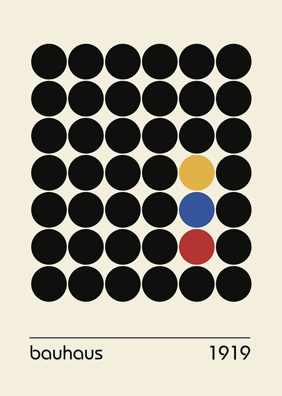
Fig. 2 The coloured dots of Bauhaus Dots 1919
are considered similar, surrounded by
homogenous dots


    1.2 Continuation
           Elements that have the same directional sense (e.g lines and curves) create continuity and a flow that our eyes naturally follow (Incharaprasad, 2023), which we then perceive and correlate the elements to be one group, regardless if the flow is cut off within the composition. 

Fig. 3 A real-life interpretation of continuation in running
track's continuous lines (CINRA Magazine, n.d.)

Fig. 4 Swiss Airline Poster (Woods, 2015) shows a plane in the midst of flying,
with the white curves inferring the motion of the plane and flow of design.


    1.3 Closure
           Where our mind fills the gaps and unknown spaces to complete the image by reification (Interaction Design Foundation, 2016) (making sense of something), rather than accepting the non-significance of the elements if we did not reify. 


                  Fig. 5 Finding Dory by Michael Friebe (n.d.) evokes closure by
                      having elements of an unfinished 'Dory' which allows us to
                  fit in the gaps of the composition.

Fig. 6 The Toblerone logo showcases a mountain; within that mountain
encapsulates an empty gap which poses in the shape of a bear.


Fig. 7 The Cologne Zoo logo at first glance is a green elephant with interesting
gaps within the body, however we are still able to make it out as an elephant,
and the gaps also pose as smaller animals.


    1.4 Proximity
            The spacing of elements between others gives us an impression of either relation or difference, where closely spaced elements are identified to be related, as opposed to elements spaced farther from one another. (Interaction Design Foundation, 2016)


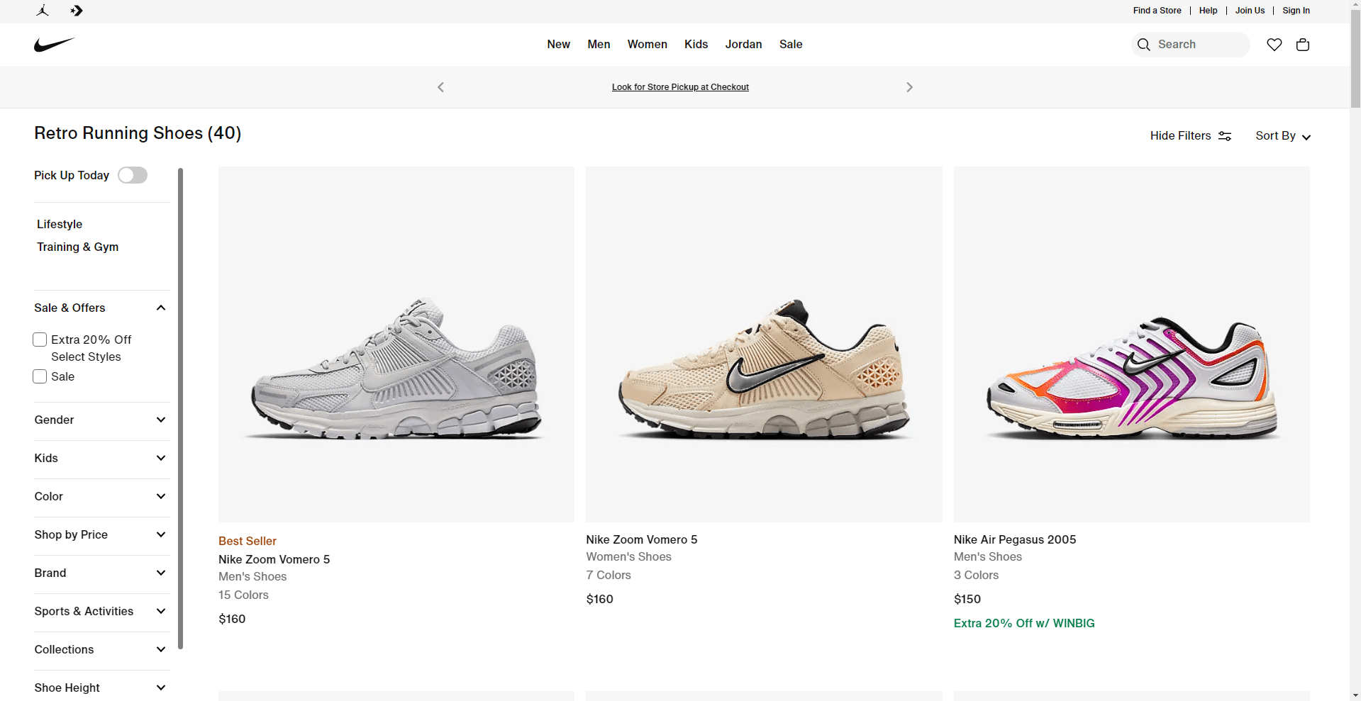
Fig. 8 The Nike website (Chornyy, 2024) utilises proximity to group related items together,
to allow the customer to have an easy viewing and user experience by understanding
the categories that are related or not.


    1.5 Figure / Ground
            A principle that utilises the negative and positive space of a composition to allow us to distinguish the foreground and background of an image (Chapman, n.d.); usually consisting of contrasting elements like colour and shape.

                       
                             Fig. 9 The poster for the Bologna Festival 2012 (n.d.)
                             shows the foreground being 2 violins and a bow tie 
                             accompanied by a white background, however
                             the white can be seen as the foreground of
                              a man wearing a bowtie.
Fig. 10 Coca-Cola ad by Ogilvy New York (2014)
demonstrates effective use of negative/positive space
where the red could be seen as the foreground of 2
people, or the background of a white flower in bloom.


    1.6 Symmetry and Order

        Symmetrical elements or elements in a specific order are grouped by our brains to be classified as correlated (
Pod Creative, n.d.) or a whole, whereas disorganised and asymmetrical elements seem divided and unrelated. 

           
Fig. 11 This piece (Gencer. G, Pinterest) reflects symmetry through identical faces
aligning in a rotating order, with the top 2 faces creating perfect symmetry
and the typography to align well, and the bottom face aligning with
the centre axis and being apart of the composition.


2. Contrast

Contrast is a design principle that highlights the difference between elements, which in turn creates emphasis and can be used to draw attention towards something and create dynamism (Alarakha. 2017). Contrast can be made through choices of different colours, sizes, spacing and textures that stand out from other elements, and without contrast elements will look monotonous and uncaptivating. 

Fig. 12 The use of colours and typography in New York 
Museum Of Glass (Porto, n.d.) 
reflect a contrasting element between the red, blue, and white.

Fig. 13 Contrasting colours can be seen on each panel,
creating an image 
of Che Guevara by Andy Warhol (1968)
that distinguishes itself from 
the rest of the composition
to seem different and 
draw attention to itself


3. Emphasis

Emphasis as a design principle is used to highlight and make important/focal an element in the composition and can be used to create hierarchy, using various techniques with elements (a striking colour, shape, use of space, etc), allowing a design to have order and a flow to guide our attention. (Sen, 2025)

Fig. 14 This poster from Hetbos (n.d) evokes emphasis from making
'april' the main focus by altering its font size.


4. Balance

Balance is how elements utilise space and are distributed in the composition, to create a sense of unity and harmony, and in some cases emphasis and movement. There are different types of balances; Symmetrical Balance, Asymmetrical Balance and Radial Symmetry- and there are also different ways to achieve balance based on rules;

    4.1 Symmetrical Balance 
            Elements evenly distributed across an axis to create symmetry and repetition, while also evoking stability and unity. (Bradley, 2017)
                     
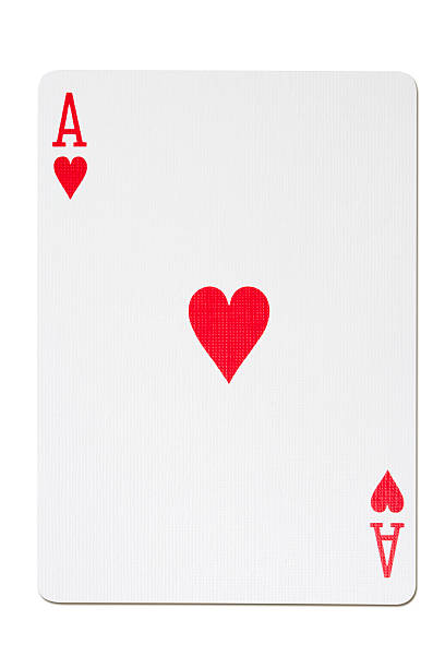
                          Fig. 15 The Ace of Hearts displays symmetrical balance
                               between the symbols, with the heart in
                               the middle. (t_kimura via Getty Images)


Fig. 16 Aesop Facial Peeling (Biktagirova, n.d) organises the
design equally on each side, with the main focus in the
centre, balancing its weight on each side.


    4.2 Asymmetrical Balance
            Different weights of elements distributed across the composition to create emphasis and dynamism. (Bradley, 2017)


 Fig. 17 The magazine cover House and Leisure Vol. 10
    (Grow) (Digital) displays asymmetry through dispersing
            different elements' weights on each corner of the
        magazine, creating an inbalance.


Fig. 18 Drawing Class Still Life Set Up (n.d.) showcases
different objects of different sizes distributed across
 the composition, however creating asymmetry
through equal weight on each side in the form
 of different elements. 


4.3 Radial Symmetry
            A balance of elements that radiate around a central point based on placement which creates depth and movement. (Deguzman, 2022)

Fig. 19 Poster, Subways, 1977 (Lebowitz, 1977) shows
text radiating around the centre point, depicting a subway tunnel.


    4.4 The Golden ratio

            The Golden ratio is a principle of balance that is based off mathematical proportions to get the perfect ratio between two numbers in the Fibonacci sequence, which is 1:1.618 (Amalia Madalina Pop, 2021). This ratio is used to divided a space up in an irregular but aesthetically pleasing and balanced order which creates a grid. The Golden ratio is deemed the perfect ratio, and can be seen occurring in the composition of many natural objects, inspiring the use of it in design (Raybould, 2020). 


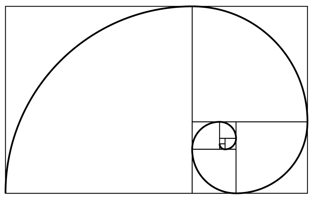
Fig. 20 An example of The Golden Ratio (Pietroluongo, 2022)


Fig. 21 An example of the Golden Ratio in nature.
Nautilus shell cut in half, by Chris 73 / Wikimedia Commons (2004)
  

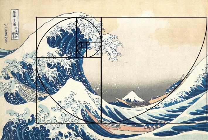
Fig. 22 A representation of the Golden Ratio in a popular artwork; The Great Wave (1831)
by Katsushika Hokusai and how the ratio creates the perfect compositional balance which pleases the eye.


    4.5 Rule of Thirds

            The Rule of Thirds is a guide that uses a grid to visually enhance and balance the composition of an image. It involves applying a 3x3 grid to a design and where the grid lines intersect is where we mainly focus on first, being where the focus of the design should be placed (Soegaard, 2023).


Fig. 23 On The Grass by Pierre-Auguste Renoir (1873) directs your eyes through the composition using the rule of three, 
where the focal points align with the grid lines. (Australian Art History, 2018)


5. Repetition

Repetition as the principle states, is a collection of elements that repeat in a sequence which depending on the elements can create a pattern that evokes movement and rhythm, and also monotony and unity (CorelDRAWn.d.). Repetition of elements that create movement usually consist of variety (an array different of elements) which make the design erratic and rhythmic, whereas repetition of similar elements create a unified, symmetrical pattern.

               
                Fig. 24 Sillons Noir by Alexander Calder (1973) consists of a repetition
             of curves that create a rhythmic pattern that look active.
Fig. 25 The repetition of the assorted lines creates a static pattern and an optical illusion that morphs from bird to fish - by MC Escher ; bird, fish (no.22), 1938


6. Movement

Movement is the effect achieved from elements that are placed in a rhythmic pattern, or have a directional value to it (e.g lines, curves, shapes), which is used to guide the viewer's eye through the composition with fluidity and ease (Hurst, 2018). 

Fig. 26 Contemporary art poster by Inessa Kamardina (2013) evokes movement through the repetition and
direction provided throughout the lines, creating a dynamic composition where it flows like ribbon.


7. Harmony & Unity

Harmony and unity are quite similar in the sense that they both give an effect of being cohesive and put-together, but are different as to how they achieve it (Chang, 2021).

    7.1 Unity
            Unity is a feeling evoked in a design which utilises the relationships between elements and the composition to create a sense of togetherness and being whole, for example using repetition and simplicity as well as cohesive colours, shapes, and a well-balanced composition to create relation.

Fig. 27 This composition involves unity through the similarity and connectedness between t
he elements through shape and repetition, yet consisting of different colours - 
SHIGEO FUKUDA Poster Competition (Aghayarov, n.d.)


    7.2 Harmony
            Harmony uses similar characteristics in different elements (Fine Design Associates, 2012) to harmonise and create a design that is meant to be, meaning all the elements fit together based on the similarities to create aesthetics, moods and evoke peace and unity in the composition. 

Fig. 28 Spiral (Pecka, n.d.) is a graphic that depicts a spiral turning in an anti-clockwise direction
that merges and mixes with the different hues, harmonising the whole composition,
rather than having separate colours flowing in different direction.


8. Symbols

Symbols in design are objects with meaning / that represent something, and is a language often used to convey something in regard to the context without using words. According to Pettersson (Pettersson, 1999, p. 2), symbols are either figurative or non-figurative, and graphic symbols under figurative symbols have 3 subgroups; 

    8.1 Pictorial symbols
            Symbols that are related to an image and represented in a simpler form.

Fig. 29 This graphic represents a swimmer swimming, composed using shapes and colours
to create a symbolic image, Graphics For Gazprom's Sports Projects (2023)


    8.2 Abstract symbols
            Symbols that represent something with a lack of detail; an abstract design. 

Fig. 30 NBC logo represents a peacock with colourful feathers; the abstract
elements put together represent another meaning; peacock,
'a symbol of innovation and excellence' (Baird, 2024).


    8.3 Arbitrary symbols
            Symbols that represent something that does not explicitly represent anything familiar, only understood because of its use in society and conventionality (Fiveable Inc. 2025)

Fig. 31 These are Gender symbols for males and females, where it does not explicitly
 represent the genders, but is a symbol recognised worldwide. Male and
Female Gender symbol icon illustration
(Free Vector)


9. Word & Image

Word and Image work well together in terms of design, where images tell us something using imagery, and paired with words would pull the full meaning together to create a clear message and design (Graphicdesign, 2015), as well as create hierarchy in the design to represent information how it should be understood first and dynamic designs.

Fig. 32 The Inception Poster (Mark Welser, 2010) expresses the relation between image and text,
where the image of inception reflects the context of the movie 'Inception', and the words
clarify the context and adds a visual dynamic of hierarchy that leads the viewer
through the composition.


Design Principles 2

Second part of Task 1


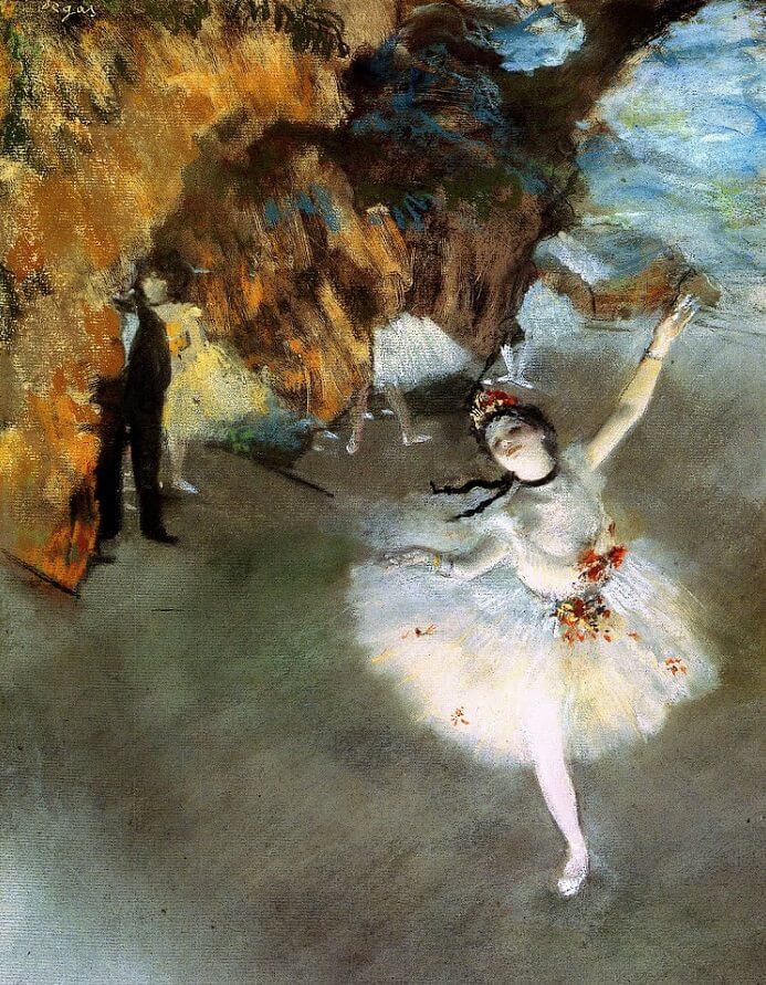
Fig. 33 L'Etoile

Title : L'Etoile (The Star - Dancer On Stage)
Year : c. 1878
Artist : Edgar Degas
Size : 60 x 40 cm
Medium : Pastel on Paper

I chose this piece as I have always been in awe of Degas's art style as well as one of his subjects, the ballerina scene which feels and seems enchanting, depicting the setting of French entertainment during his era - although the backstory behind his compositions aren't as enchanting as it seems to be, I still appreciate the style and compositional story it tells. The painting is set onlooking a vast stage, with the star - the ballerina - shining as brightly as named, as the focal point in the foreground, and a gold curtain with a man lurking in the distance with other blurred-ballerinas in the background. The detail and technique included is mesmerising, and is something I wish to achieve in my own work, causing me to enjoy this artwork so much more.

The technique using the pastel medium is soft and alluring, with broken-up, repetitive strokes as per the Impressionist style (Samu. M, 2004) creating movement and life in the composition. The colours that set the mood create a romantic, entertainment setting, and evokes contrast between the shining and bright ballerina and the strong backdrop. The contrast from the colours and techniques used on the foreground and background creates emphasis towards the ballerina, with heavy detail on her and the soft white colour she wears, compared to the blurred and rushed background. There is also a sense of asymmetrical balance, where there is focus and weight on the ballerina on one end, and the weight from the collection of strong, less dominant elements on the diagonal end.


Feedback


Week 1 (3/2/25)

Specific Feedback : To complete Tasks 1-4 stated in the MIB (Research design principles and describe 
                                 them + add pictures, include a picture that interests us and describe it.)

General Feedback : An introduction to the module and tasks given, and to create our blog and start 
                                documenting our research and content. 

________

Week 2 (10/2/25)

Specific Feedback : To include in-text citations to back my research, refer to suggested material to enhance my blog 
                                (1. https://youtu.be/IjcX2wwKmiE, 2. https://tracyangelinetiodesign.blogspot.com/2024/02/design-principles-task-1.htmland finish off 
                                my blog. Research and Pictures are approved of.

General Feedback : To continue on further with the task; complete tasks 3, 4, 5, 6, and 7

________

Week 3 (17/2/25)

Specific Feedback : To add a reflection of my task 1, and quick links to the blog.

General Feedback : Lecturer has reviewed my work; Tasks 5-7 have been completed and accepted upon
                                review; no further changes required. Further readings is not compulsory, however a 
                                reflection and quick links are.


Reflection


Experience

My experience with this task has been quite challenging, since it is my first semester in university, it took me a while to adjust to the standard of work and how things are presented, compared to college where everything was sort of 'handed' to you. Among adjusting to change, other challenges included using blogger, where I found it difficult to format things which took me a long time. 

However, overall I did enjoy this task as researching and documenting is something I enjoy, especially in terms of artworks, being able to expose myself to amazing works out there and learning more about them and how design principles influence the overall effect of the design and evocation of feelings and interpretations, and also learning quite a lot from the content of the task to the actual way lessons and consultations work. It felt rewarding to have been able to successfully complete Task 1 of my first semester.


Observation :

Observation is a big thing that helped me get through this task; there was many different kinds of observation done for this task, including observing other peers work to develop a sense of what to do and how to develop my blog further, as well as observing many design works from various sources to choose appropriate ones for each design principle; to understand what I was working with, and to identify how they exactly used a design principle and the context surrounding it. 


Findings
 
Despite having learned about design principles before, there are new things I've learned and found out about them, like what / how Gestalt Principles are and worked, and what Symbols and Word & Image were as design principles, and just generally finding out more in-depth information about each principle through lectures and research. Design principles are more than fundamentals of art and composition, they utilise visuals to communicate and evoke certain moods, ideas, and interpretations that are so important to making an art work meaningful, as well as look good and interesting.


References


Amalia Madalina Pop. (2021, November 16). What Is the Golden Ratio and How to Use It in Graphic Design. Creatopy Blog; Creatopy Blog. Online URL : https://www.creatopy.com/blog/golden-ratio-in-graphic-design/

Arbitrary signs - (Intro to Literary Theory) - Vocab, Definition, Explanations | Fiveable. (2025). Online Url : https://library.fiveable.me/key-terms/introduction-to-literary-theory/arbitrary-signs

armagadon. (n.d.). Download Male and female gender symbol icon illustration for free. Vecteezy. Online URL : https://www.vecteezy.com/vector-art/4581255-male-and-female-gender-symbol-icon-illustration

Ashley. (n.d.). [Pinterest Image]. Pinterest. Online URL : https://www.pinterest.com/pin/410179478580426423/ 

Baird, R. (n.d.). In “Living Color.” Online URL : https://www.logohistories.com/p/nbc-peacock-logo-history-1986

Bauhaus Dots 1919. (2025). Online URL : 

            https://gallerix.co.uk/poster/5215-bauhaus-dots-1919

Biktagirova. O. (2024, November 27).  Дизайн карточки товара [Pinterest Image]. Pinterest. Online URL : https://kr.pinterest.com/pin/625367098313009041/

Bird, fish (No. 22), 1938 by Maurits Cornelis Escher: History, Analysis & Facts [Graphics]. (2025). 

            Arthive. Online URL : https://arthive.com/escher/works/200117%7EBird_fish_No_22

Bradley, S. (2017, March 10). Design Principles: Compositional, Symmetrical and Asymmetrical Balance — Smashing Magazine. Smashing Magazine. Online URL : https://www.smashingmagazine.com/2015/06/design-principles-compositional-balance-symmetry-asymmetry/#:~:text=Asymmetrical%20balance%20is%20more%20dynamic,between%20elements%20are%20more%20complex.

Chang, J. (2021, November 26). UNITY & HARMONY: The Principles of Design | Winged Canvas Blog

            Winged Canvas. Online URL : https://www.wingedcanvas.com/single-post/unity-harmony-the-

            principles-of-design

Chapman. C (n.d.), 'Exploring the Gestalt Principle of Design', Online URL : 

            https://www.toptal.com/designers/ui/gestalt-principles-of-design

Che Guevara, 1968 - Andy Warhol - WikiArt.org. (2012). Online URL : https://www.wikiart.org/en/andy-warhol/che-guevara

Chornyy. A. (2024), What is a User Interface (UI): Analysis on the Example of the Nike Online Store

            Online URL :  https://www.plerdy.com/blog/what-is-a-user-interface-ui/

Chris 73. (2004. May 5). File:NautilusCutawayLogarithmicSpiral.jpg [Photograph]. WikiMedia 

            Commons. Online URL : 

            https://commons.wikimedia.org/wiki/File:NautilusCutawayLogarithmicSpiral.jpg#met

CorelDRAW(n.d.). Repetition in Graphic Deisgn: Understanding What it Means and How to Use it

            Online URL : https://www.coreldraw.com/en/tips/graphic-design


Alarakha. A. (2017, September 30). Contrast Principle Of Design. Graphic Design Services in Kenya. 

            Online URL : https://254-online.com/contrast-principle-of-design/

Crafting Cohesion: The Gestalt Principle of Symmetry and Order | Pod Creative. (n.d.). Podcreative.ca. 

            Online URL : https://podcreative.ca/crafting-cohesion-the-gestalt-principle-of-symmetry-and-

            order/

Degas. E. (c. 1878). L'Etoile (The Star) [Pastel on paper]. www.Edgar-Degas.net. Online URL : 

            https://www.edgar-degas.net/the-star.jsp

Deguzman. K. (2022, July 9). What is Radial Balance in Art — Composition Techniques. StudioBinder. 

            Online URL : https://www.studiobinder.com/blog/what-is-radial-balance-in-art-

            definition/#:~:text=Radial%20balance%20is%20often%20a,of%20focus%20in%20an%20image.

ethansmithtafe. (2014, July 28). Post 16: The Golden Ratio In Nature. Ethansmithblog. Online URL : 

            https://ethansmithblog.wordpress.com/2014/07/28/post-16-the-golden-ratio-in-nature/

Friebe. M. (n.d.), 'Finding Dory by Michael Friebe' [Poster],  Online URL : 

            https://alternativemovieposters.com/amp/finding-dory-by-michael-friebe/

Geray Gencer (n.d.) [Pinterest Image], Pinterest, Online URL : 

            https://www.pinterest.com/pin/127648970683861158/

Gianatasio. D. (2014), 'Coca-Cola Has Flower Power in Ogilvy Ads for Its New PlantBottles' [Poster]

            Online URL : https://www.adweek.com/creativity/coca-cola-has-flower-power-ogilvy-ads-its-new-

            plantbottles-158273/

Graphics for Gazprom’s sports projects. (2021). Artlebedev.com. Online URL :

            https://www.artlebedev.com/gazprom/sport/

hallie pt. 2 (n.d.) Drawing Class Still Life Set Up. Pinterest. Online URL : 

            https://www.pinterest.com/pin/7318418139298967/

Hampton-Smith. S. (2018), 'The Designers Guide To Gestalt Theory', Online URL : 

            https://www.creativebloq.com/graphic-design/gestalt-theory-10134960

House and Leisure Vol. 10 (Grow) (Digital) [Magazine]. (2024, July 2). Pinterest. Online URL : https://www.pinterest.com/pin/133630313945355523/

How to use negative space for positive impact. (2015). Blogspot.com. Online URL : https://outsource-uk.blogspot.com/2014/06/how-to-use-negative-space-for-positive.html

Hurst, A. (2018, July 15). Movement - A Principle of Art. Thevirtualinstructor.com. Online URL : https://thevirtualinstructor.com/blog/movement-a-principle-of-art

Incharaprasad. (2023, June 1). The Law of Similarity: Creating Visual Consistency. Kubo. Online URL : https://medium.com/kubo/the-law-of-similarity-creating-visual-consistency-77d59957f14c

Incharaprasad. (2023, May 26). The Law of Continuity: Designing for Smooth Transitions. Kubo. Online URL : https://medium.com/kubo/the-law-of-continuity-designing-for-smooth-transitions-c048bc1ced5

Jeter, M. (2018, December 18). Samuel Lebowitz, Subways, 1977 [Poster]. Pinterest. Online URL :  https://ru.pinterest.com/pin/187603140714153714/

Kölner Zoo Logo (2014, August 4), An Optical Illusion, Online URL :     

            https://www.anopticalillusion.com/2014/08/kolner-zoo-logo/#google_vignette

Soegaard, M. (2023, September 4). Rule of Thirds: The Definitive Guide & Examples. The Interaction Design Foundation; Interaction Design Foundation. Online URL : https://www.interaction-design.org/literature/article/rule-of-thirds-examples?srsltid=AfmBOooW2tH7KhM0jmPAIhW2KD8zB6sIgSBPUYAyWlz8WmsSKkZzaI15

markwelser. (2010, September 9). Inception Poster [Poster]. Deviantart.com; DeviantArt. Online URL : https://www.deviantart.com/markwelser/art/Inception-Poster-178581661

Mauney, A. C. (2021, July 6). The Golden Ratio Revealed in 7 Masterpieces. Art & Object. Online URL : https://www.artandobject.com/slideshows/golden-ratio-revealed-7-masterpieces

O'Connell. M, (1993), 'Textile' [Block printed linen]National Gallery of Victoria, Online URL: 

            https://www.ngv.vic.gov.au/explore/collection/work/48710/

Pecka. V. (2016). Spiral [Poster]. InspirationGrid. Online URL : https://theinspirationgrid.com/posterlad-an-art-project-by-vratislav-pecka/

Pietroluongo, L. (2022, September 14). The Golden Ratio: The Ultimate Guide to Understanding and Using It. Elegant Themes. Online URL : https://www.elegantthemes.com/blog/design/the-golden-ratio-the-ultimate-guide-to-understanding-and-using-it

Porto. L. (2014, January 22), New York Museum of Glass [Image]. Behance. Online URL : https://www.behance.net/gallery/12139169/New-York-Museum-of-Glass

Principles of Composition - Fine Design Associates. (2012). Fine Design Associates. Online URL : https://finedesignassociates.com/resources/principles-of-composition/#:~:text=Unity%20is%20achieved%20when%20each,elements%20relate%20to%20each%20other.

PRTimes. (2019), 写真家・瀧本幹也が撮り下ろす美しい瞬間 資生堂、企業文化誌『花椿』秋号

            が7月15日に刊行!,  Online URL : https://prtimes.jp/main/html/rd/p/000001459.000005794.html

Raybould. B. (2020, October 30). 3 Steps For Using The Golden Ratio To Create Masterful Paintings

            Online URL : https://www.virtualartacademy.com/golden-ratio-in-art/

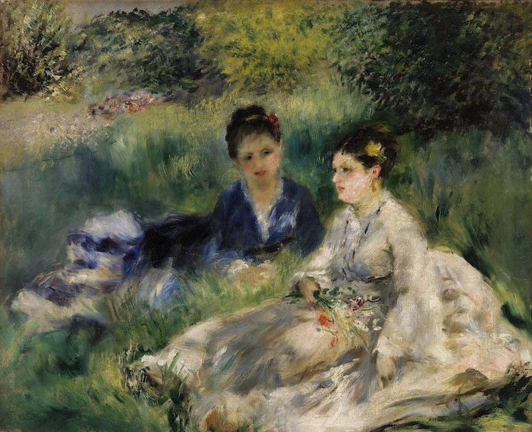
Renoir. P. A. (c. 1873). On The Grass [Oil painting]. Australianarthistory. Online URL :  https://www.australianarthistory.com/rule-of-thirds#:~:text=The%20Fighting%20Temeraire%2C%201838%20by,along%20the%20first%20vertical%20line.

Samu, M. (2004, October). Impressionism: Art and Modernity - The Metropolitan Museum of Art. Metmuseum.org. Online URL :https://www.metmuseum.org/essays/impressionism-art-and-modernity

Sen, J. (2025, January 4). Design Principles | Emphasis Principle of Design | Focal Points. PREZENTIUM. Online URL : https://prezentium.com/emphasis-principle-of-design/#:~:text=The%20emphasis%20principle%20of%20design,important%20elements%20before%20anything%20else.

Shigeo Fukuda Poster Competition by Khudayar Aghayarov [Pinterest Image]. (2025). Creativepool.com. Online URL : https://se.pinterest.com/pin/89860955058647402/

Sillons Noir by Alexander Calder (1973). equatorjournal. Online URL : https://equatorjournal.com/post/165736633256/alexander-calder-sillons-noir-1973

t_kimura. (2012, August 4). Ace of Hearts Stock Photo [Stock Image]. iStock. Online URL : https://www.istockphoto.com/photo/ace-of-hearts-gm471446071-21053848

The Gestalt Principles. (2016, August 30). The Interaction Design Foundation; Interaction Design Foundation. Online URL : https://www.interaction-design.org/literature/topics/gestalt-principles?srsltid=AfmBOorykqioHY6k-Y6x7nz6WYbThWhYJpixN1fx3t4whpitB21HX-Aa#docs-internal-guid-8962efed-7fff-4836-e896-b98c0f606ace

The Star (Dancer on Stage) (c.1878) by Edgar Degas – Artchive. (2024). Artchive.com. Online URL : https://www.artchive.com/artwork/the-star-dancer-on-stage-edgar-degas-c-1878/

Timmers, S. (n.d.). 'Why the Gestalt Principles Matter in Graphic Design'. Online URL : 

            https://www.manypixels.co/blog/graphic-design/gestalt-principles

Understanding the Importance of Balance in Graphic Design. (2014). Pluralsight.com. Online URL : https://www.pluralsight.com/resources/blog/software-development/understanding-balance-graphicdesign#:~:text=What%20is%20the%20principle%20of,diagonally%2C%20or%20background%20versus%20foreground.

winnie zheng (n.d), '2012 Bologna Festival' [Pinterest Image], Online URL : 

            https://www.pinterest.com/pin/313915036498649018/

Woods. K. (2015), 'Airlines Posters' [Poster]Online URL : 

            https://www.behance.net/gallery/22522185/Airlines-Posters

Word and Image | graphicdesign. (2015). Graphicdesign. Online URL : https://ranchographics.wixsite.com/graphicdesign/word-and-image


Quick Links :

Design Principles: Task 1 | Exploration

Design Principles: Task 2 

Design Principles: Task 3

Design Principles: Final Compilation


Comments

Popular posts from this blog

TASK 3 : Development & Design

Final Compilation