Haley Alexandra Gray | 0369029
Bachelors of Design (Honours) in Creative Media
Design Principles GCD60804
Task 2 | Week 3 - 5 (17.2.2025 - 30.2.2025)
Table of Content :
Lecture Material
Design Principles GCD60804
Week 3
1. Visual Analysis
- Is a method of understanding design that focuses on visual elements and principles
- 'A description and explanation of visual structure for it own sake'
- Is also able to recognise choices a designer makes in creating a design
- Understand how the formal properties of design communicate ideas, content, and meaning.
- Is a skill that helps people read and critically interpret images
- 3 Stages on how Visual Analysis works:
- Phase 1 : Observation
- Closely looking at / identifying elements of the design and describing them in your own
words.
- Is about looking, thinking and finding good language to effectively communicate
- Do not read beforehand about the design
- Phase 2 : Analysis
- Requires you to think about the observations made, and try to make statements about the
work based on observation
- Think about how the elements identified go together to create design principles that
will complete the design, and the effects it has on the viewer
- Phase 3 : Interpretation
- The final phase will be a collection of previous phases, plus facts about the design work and
context from creditable sources
Instructions
MIB for Bachelors of Design (Honours) in Creative Media | The Design School at Taylor's University 2025
Task 2 | 1 - 2
Visual Analysis and Ideation
Recap :
For the second task of the semester, we will have to tackle analysis, investigation and documenting of the composition and design principles of the art work chosen in Task 1. We will have to write-up a visual analysis of about 300 words of the artwork selected, as well as sketching 3 ideas on how it can be improved.
Artwork chosen in Task 1 -
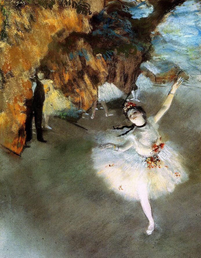 |
Fig. 1
Title : L'Etoile (The Star - Dancer On Stage) Year : c. 1878 Artist : Edgar Degas Size : 60 x 40 cm Medium : Pastel on Paper |
Observation :
In this portrait piece, the main focus is on the ballerina, on the right of the composition who seems to be in the middle of her performance. Her limbs are in motion; one leg raised and arm extended gracefully, and her soft, white dress embellished with red and yellow flowers. The lighting imposes a dramatic impression, where shines on the ballerina and creates vibrant colours and shadows. In addition to that, I have noticed that Degas has used pastels as a medium for this work, from observing the unique techniques used to express the colours, texture and blending of the work. The background depicts what seems to be big, textured gold curtains, with sight of blurry performers and people at standby, and on the right side is supposedly a blue sky and a house from a distance, perhaps posing as the backdrop for the performance. (145)
Analysis :
We are immediately drawn to the ballerina in the foreground, due to the contrast in colour and style, where her design consists of bright colours opposed to the dark and strong background, and she retains detailed and fine brush strokes in comparison to the rest of the composition, acting as a focal point. Her position in the composition aligns with the Rule of Thirds, where it makes the composition more compelling and attractive, which naturally directs the eye to the areas of intersection, and evokes asymmetrical balance due to a heavy emphasis and weight on the right side, balanced by the full background scene parallel to her. The use of strong and repetitive brush strokes of multiple tones & colours and tones can be seen, creating movement and giving life to the backstage scene and a blurry, busy effect to the overall background, furthermore utilising the Gestalt Principle of similarity, where the similar colours and textures are grouped which represent gold curtains. The whole composition lacks mundanity due to the variety of elements, creating an overall sense of unity where each element has its own purpose and come together to narrate the theme of the artwork. (195)
Interpretation :
This work by Degas was created during the Impressionist movement which we can identify from the use of the prominent brush strokes, depiction of light and colours, as well as the candid impression of the subject (Artistcoveries, n.d.), in this case appears to be the dancer during her performance and the backstage activity. The artwork seems to convey a realistic impression on what the performance scenes are typically like, where everything is calm and focused on-stage; the main focus is on the glowing dancer who looks satisfied with her performance, with her chin held up high with a pleased look on her face, which shows us that she is enjoying the recital, whereas what goes on in the background is blurry and complex, with a lot of movement, as well as on-lookers lurking in the background, suggesting that the backstage scene is bustling during performances like this, as well as holds a brooding narrative that reflects the ballet scene in the 19th century (Wheeler, 2019). The overall atmosphere holds a dramatic and realistic feel to it, however a serene and pacific atmosphere for on-stage, relative to the context of the performance scene. (191)
Task 2 | 3
Sketches
Sketch 3 ideas on how the selected design can be improved, describe each idea with rational of 30-50 words - may include visual references.
1.0 First Sketch (Process)
 |
| Fig. 2 Process Sketches |
To improve the previous artwork, my first idea was to add more focus and emphasis on the dancer and create a more symmetrical composition as opposed to the original work, where she is now placed in the middle of the stage, accompanied by an equal stage setting on each side.
- Still retains Impressionist style and intense lighting / colour, however curtains / background have been rendered to have more detail and design to it.
Visual Reference (1) :
|
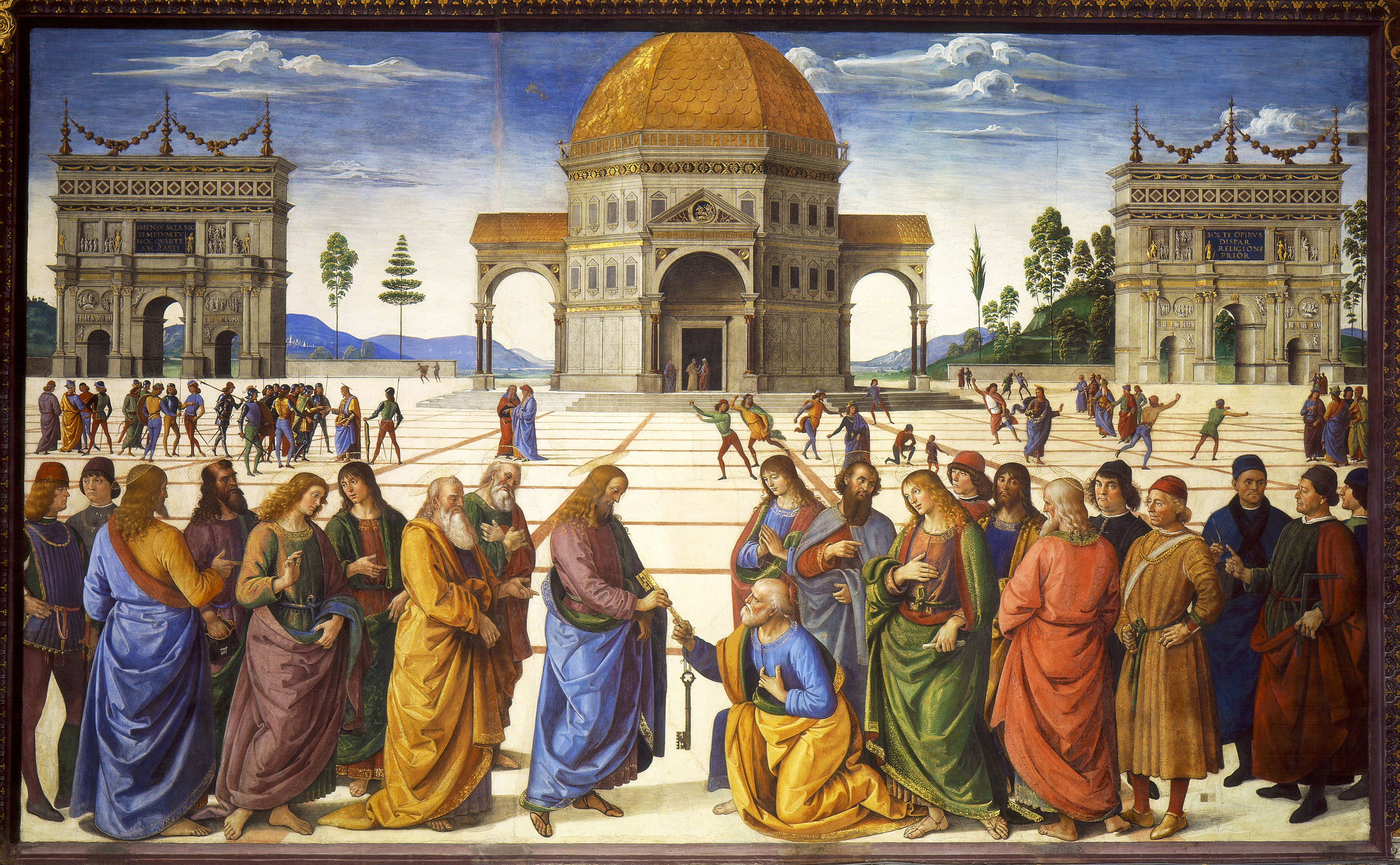
Fig. 3 Perugino, Christ Giving the Keys of the Kingdom to St. Peter, Sistine Chapel, 1481-83
A symmetrical composition providing stability and balance to the work, as well as focuses on the foreground due to the contrasting and various elements that stray from symmetry, however still maintain equal weight on each side.
|
1.1 First Sketch
 |
| Fig. 4 Final Sketch 1 |
After receiving feedback, I focused on the darker concept of the original painting where her sponsor is watching her closely, with a large, intimidating eye. To make the composition more compelling, I applied the Rule of Thirds, as well as utilised lighting and shadow to create a foreboding feel, as well as emphasis on the dancer using a spotlight, which illuminates her in contrast to the dark background and gives her a sense of purity and brightness.
Visual Reference (1.1) :
 |
| Fig. 5 Pinterest, n.d. This piece depicts all eyes surrounding a small person, creating intimidation and menace. |
_______________
2.0 Second Sketch (Process)
 |
| Fig. 6 Process Sketch 2 |
The idea for this sketch was to again, create more emphasis around the ballerina, this time by upsizing her form and utilising the Rule of Thirds to give way for the background as well, and contrast between her and the background by using a technique with colours and blending to create movement, to replicate the busy background in the original, and for her to perform still, amidst the movement behind her.
Visual Reference (2) :
These references are to study the effect of motion blur.
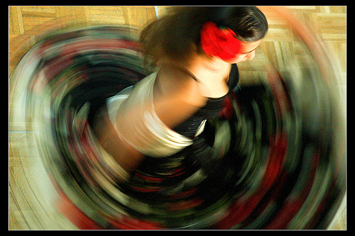 |
Fig. 7 CameraOne, Flamenco Dancer (2009)
|
 |
Fig. 8 Jeff Tamblyn, Carts (n.d.)
|
2.1 Second Sketch
 |
| Fig. 9 Final Sketch 2.1 |
 |
| Fig. 10 Final Sketch 2.2 from a top-view angle |
Rather than having the background in motion, the ballerina has been displayed to be moving using active brush strokes, creating
movement to the composition which showcases the liveliness in the performance, and we are able to see the extent of her movements and gives a sense of direction which addresses her actions.
The idea remains to create more emphasis towards the ballerina and her facial expression, however through contrast of the still / movement, as well as colours.
Fig. 11 These references display photographs taken of dancers, with a motion blur effect that conveys movement in their actions as well as emphasis on still parts of the composition, i.e the head is in focus while the rest of the body is blurred.
_______________
3.0 Third Sketch (Process)
Initial idea was to display the context based on the original works', where the reality of performances are a dark tragedy hiding behind a perfect performance facade. To bring out this sensation, I utilised
contrasting colours and
asymmetrical balance.
3.1 Third Sketch
 |
| Fig. 14 |
The third sketch plays with the concept of the reality of performances, where behind the facade of a great performance is a darker life behind the curtain, seen in Degas' work. Figure/ground principles are prominent, where busy silhouettes of ballerinas act as the foreground, with the lurker and performer as the background, with the use of negative / positive space as well. Scale and proportion was vital for this sketch to create a visualisation of a scene from the back view as if we are backstage, and depth by utilising lighting and shadow as well.
Feedback
Week 3 (17/2/25)
General Feedback : To recap on Task 2, and start on questions 1 and 2.
________
Week 4 (24/2/25)
Specific Feedback : To complete questions 1-2 and start 3, follow guide of the format on how to complete
the write-up and use specific language for each subtopic to enhance writing, label the
recap, observation, analysis, and interpretation.
General Feedback : Finish the required tasks before each consultation and to continue, refer to the brief to
stick to theme of blog presentation and content.
________
Week 5 (3/3/25)
Specific Feedback : For the first sketch, move the dancer down, to have more to explore and play with in
the background, i.e. hide things, and utilise proportion to make things more
interesting. Second and third sketch have compositional issues, too much tension on
the right where the ballerina is squished to the side, have it more centred and more
movement.
General Feedback : Enhance design work further with specific feedback given, uninteresting designs.
Experience :
My overall experience with this task was interesting, to say the least. The concept of having to improve an existing artwork with no further explanation on what had to be improved except with the utilisation of our knowledge of design principles is something that seemed almost impossible to me, where I could not find the line between improving the composition, or changing the whole work completely. It was a long thought process, and I did not risk changing the whole composition initially, until after feedback where I was told to make things more interesting, which I hopefully have achieved by adding more elements to the sketches. If this task taught me anything - other than how to use design principles in my own work - it would be to open my mind up more, because I started this task thinking about how I could not do it, rather than getting more creative about how to actually do and understand it better, which would probably have made it more enjoyable.
Observation :
From what I have noticed in this task, is that almost, if not every artwork contains design principles in some form, and how useful they actually are to create a desired effect for an artwork. The drawing process allowed me to practice and utilise more organisation and thought by implementing the design principles, something that I have not thought much about when drawing in the past. I have also studied various other artworks to achieve a similar effect they had created by observing the use of elements composed together to create the principles.
Findings :
All in all, I have come to realise more about design principles than I thought I knew or had already realised. Design principles are present in all works of art, and are essential for creating compelling works that communicate all types of feelings, moods and even stories. Additionally, I have also found out about how to categorise and write a visual analysis, with detailed accounts of observations and interpretations. This allowed me to find out more about effective uses of design principles through my study of my chosen artwork, and what Degas wanted to convey, as well as general information like the Impressionist style, and the reality of the ballet scene in France during Degas' era.
Arthaven, (n.d.), Wallpaper [Pinterest Image], Pinterest, Online URL :
Artistcoveries. (2018, December 13), Impressionist Styles, Online URL :
CameraOne. (2007, September 9). Flamenco Dancer [Photograph]. Flickr. Online URL :
Digital Camera World, (n.d.), [Photograph], Pinterest, Online URL :
Fiore. J. (2021, January 6), The sordid truth behind Degas’ ballet dancers, CNN, Online URL :
gabo Delgadillo (n.d.), [Pinterest Image], Pinterest, Online URL :
Perugino. P. (c. 1481), Christ Giving the Keys of the Kingdom to St. Peter, Sistine Chapel [Oil on Canvas],
Wheeler. C. (2019, February 22), The Star or The Victim, Medium. Online URL :
Quick Links :
Design Principles: Task 1 | Exploration
Design Principles: Task 2
Design Principles: Task 3
Design Principles: Final Compilation


Comments
Post a Comment